Math 6 and Math 6+ students began class by creating a frequency table and histogram from the data set pictured below:


Skills that were introduced, modeled, practiced, and informally/formally assessed today in class include:
25 40 35 10 33 29 30 28 12 40
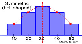
Once that was complete, Mr. Giomini introduced and modeled Lesson 8.7: Summarize Data Distribution. Below you'll see some of the different distributions that we discussed.
Skills that were introduced, modeled, practiced, and informally/formally assessed today in class include:
Math 6 and Math 6+:


- Display numerical data in plots on a number line, including dot plots (line plots), histograms, and box plots.
- Recognize and formulate a statistical question as one that anticipates variability and can be answered with quantitative data.
- Choose the measures of center and variability, based on the shape of the data distribution and the context in which the data were gathered.


 |
| This kid loves math so much that he brings me a cookie shaped as a number everyday. |
Excellent article and interesting one to read. I am very glad to see this kind of article. Thanks! keep rocking.
ReplyDeleteEthical Hacking Course in Bangalore
Ethical Hacking Institute in Bangalore
Hadoop Training in Bangalore
German Classes in Bangalore
Selenium Training in Bangalore
Data Science Training in Bangalore
German Language Course in Bangalore
Selenium Course in Bangalore